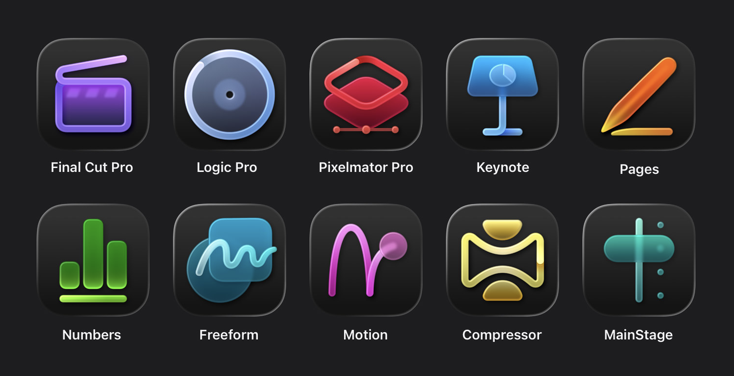
It seems like these new icons were designed so that they could form a rainbow marketing image rather than as actual usable, beautiful icons for your dock. Each one has almost entirely lost its identity. Some make no sense at all. These are the first Liquid Glass era designs that I truly dislike.

