Tinted Liquid Glass Should be the Future of User Interfaces on Apple Platforms
It’s certainly no secret that I am a huge fan of Apple’s new liquid glass design language. I know that’s not technically the name of the design system, in fact there actually isn’t one. Liquid glass is simply the core material of the new user interface, not the actual language. But for the sake of simplicity, I’m going to call it liquid glass regardless. I find the new look and feel to be extremely refreshing after more than a decade of flat visuals that generally lacked personality. Because liquid glass is so fluid, it comes to life when user interface elements move or get tapped. The playfulness of liquid glass hasn’t been up for debate, it seems to be generally well-received. But the actual look of the material, the clear component that is the namesake liquid glass, is controversial to say the least. Over the past few days I’ve started to think about how it could evolve over the next few years and I think I might have figured it out.
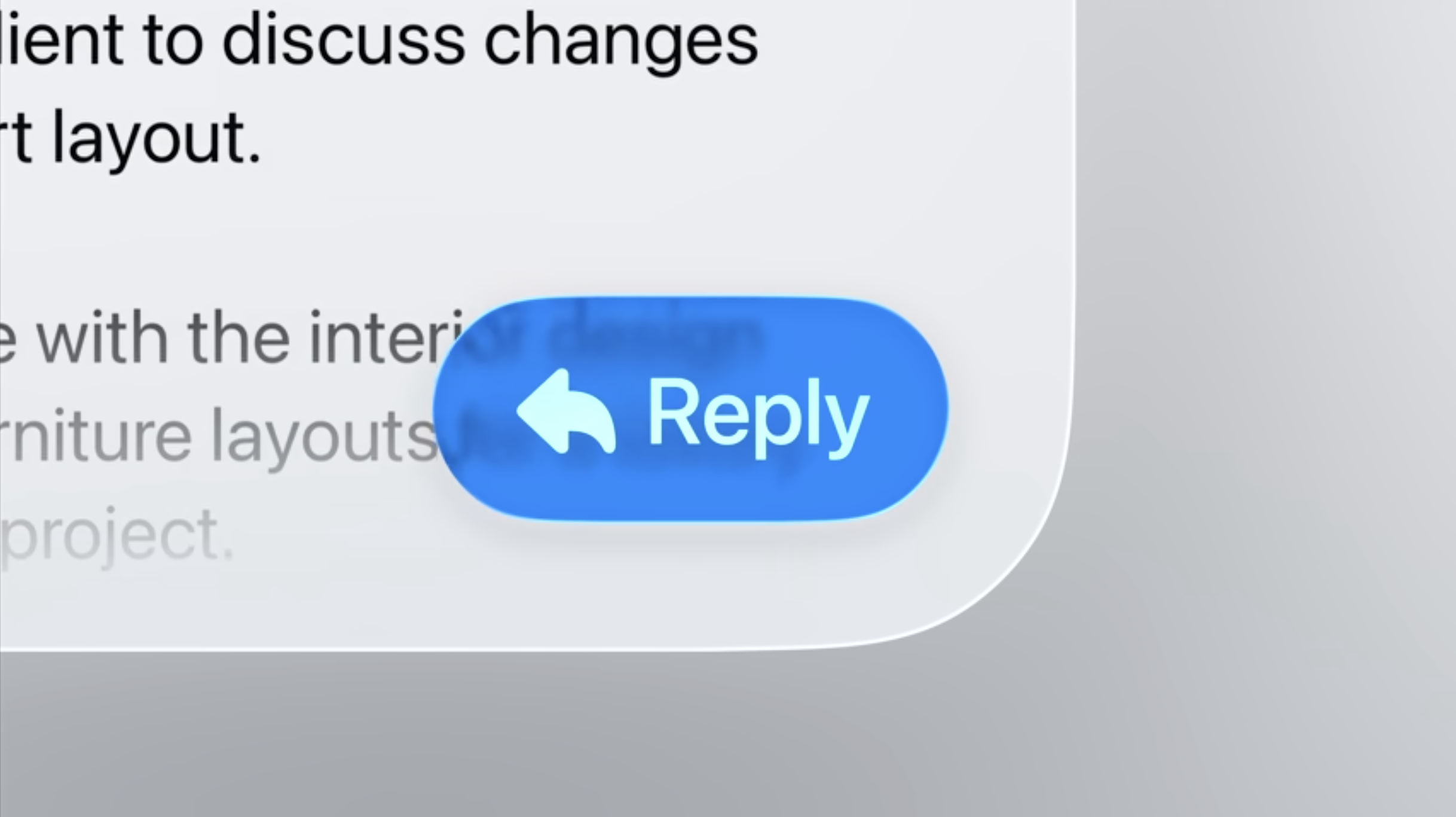
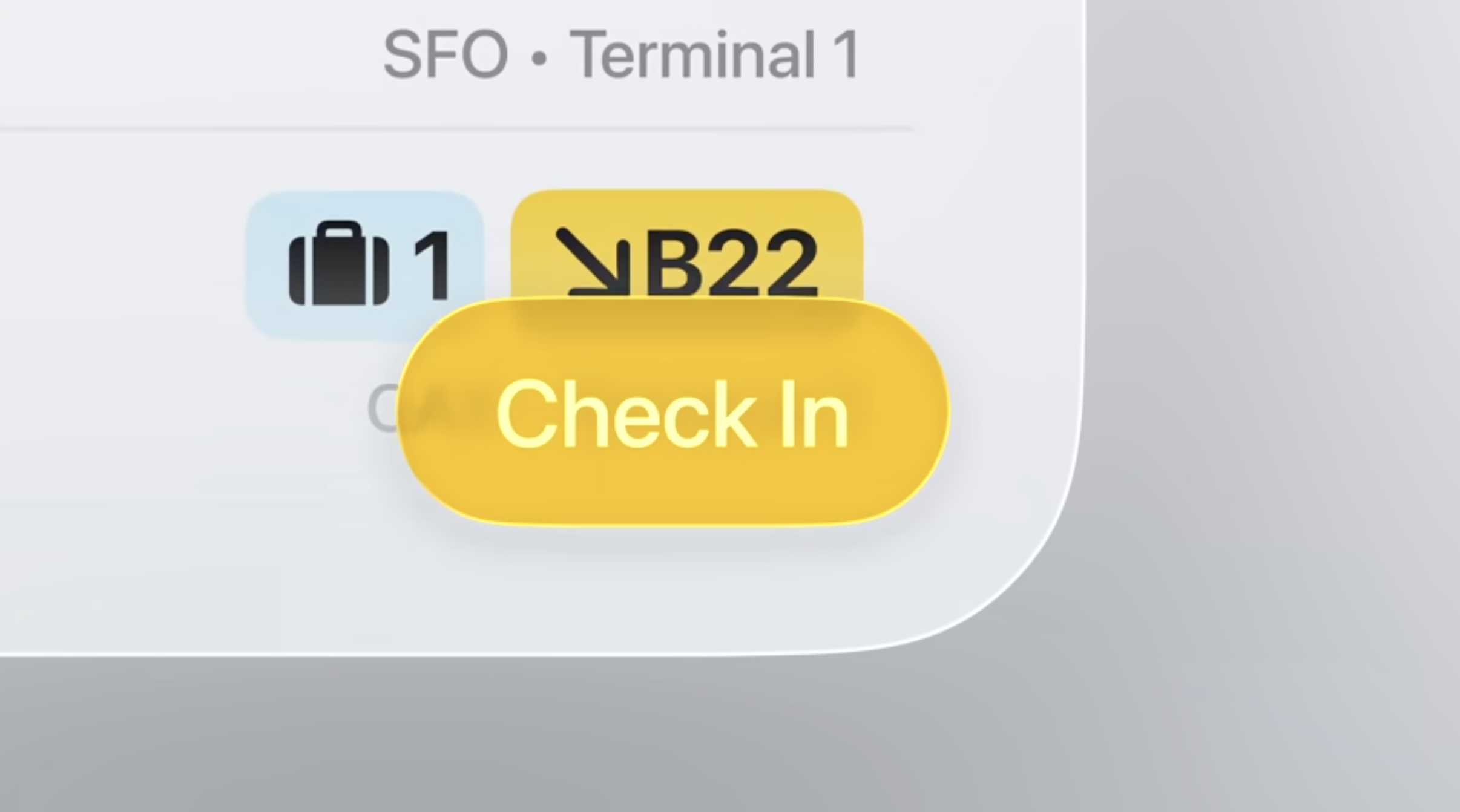
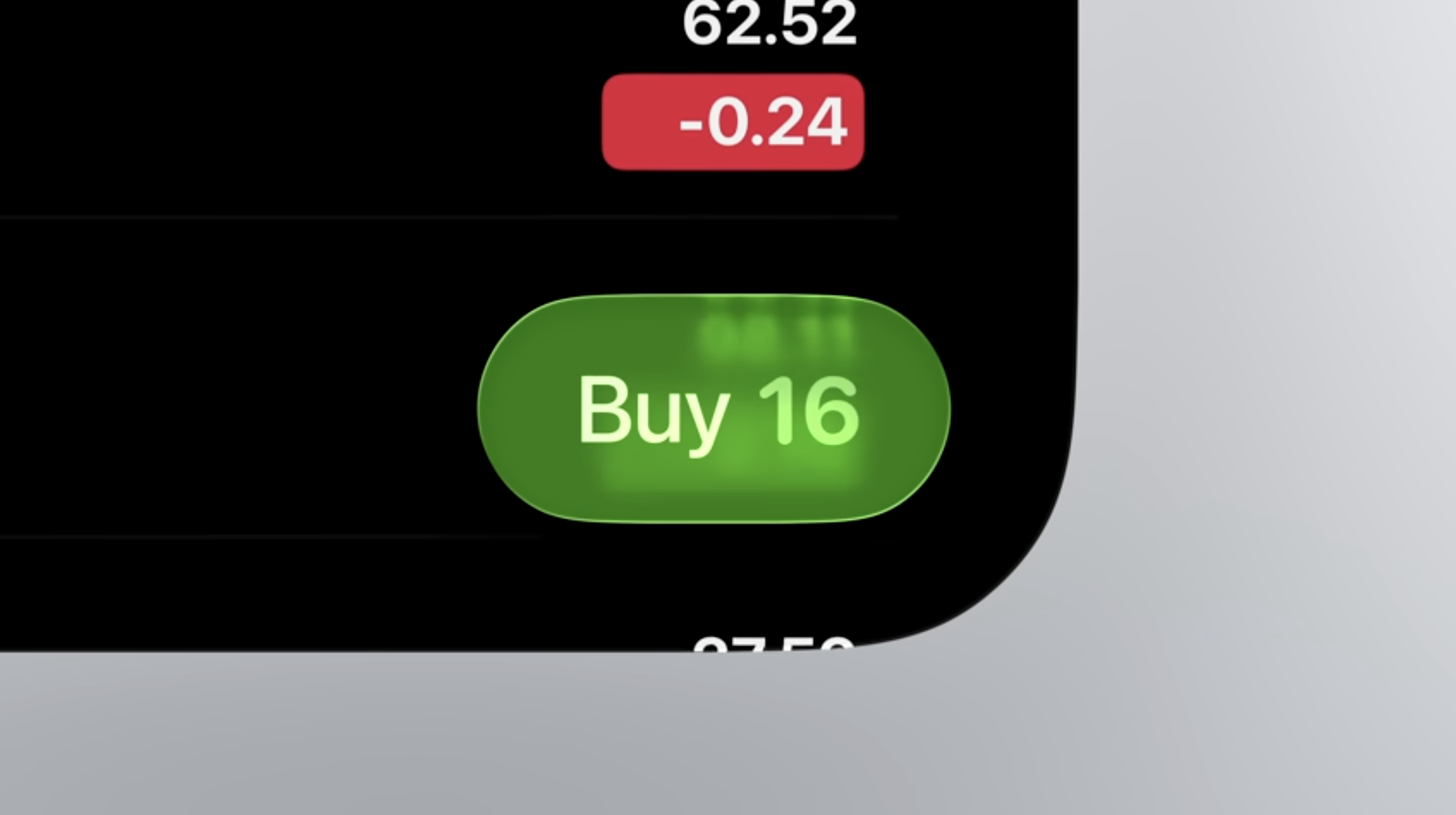
One of the main issues with liquid glass is legibility, there’s a sense that despite liquid glass supposedly being designed to promote your content that it actually occludes it. Yes, elements like buttons, menus, tabs, and others are more defined compared to when they were often just text. But to many they are hard to read or distinguish in several situations. I recently looked back at some of the sessions from WWDC and it occurred to me that we are rarely seeing one particular aspect of liquid glass in practice. Apple is not taking nearly enough advantage of tinting. Sure, you can tint your clock on the lock screen or the icons on your home screen. There are buttons here and there in some apps, but they’re usually not at the top level. The reality is that there needs to be more of this colorful liquid glass all throughout the system.
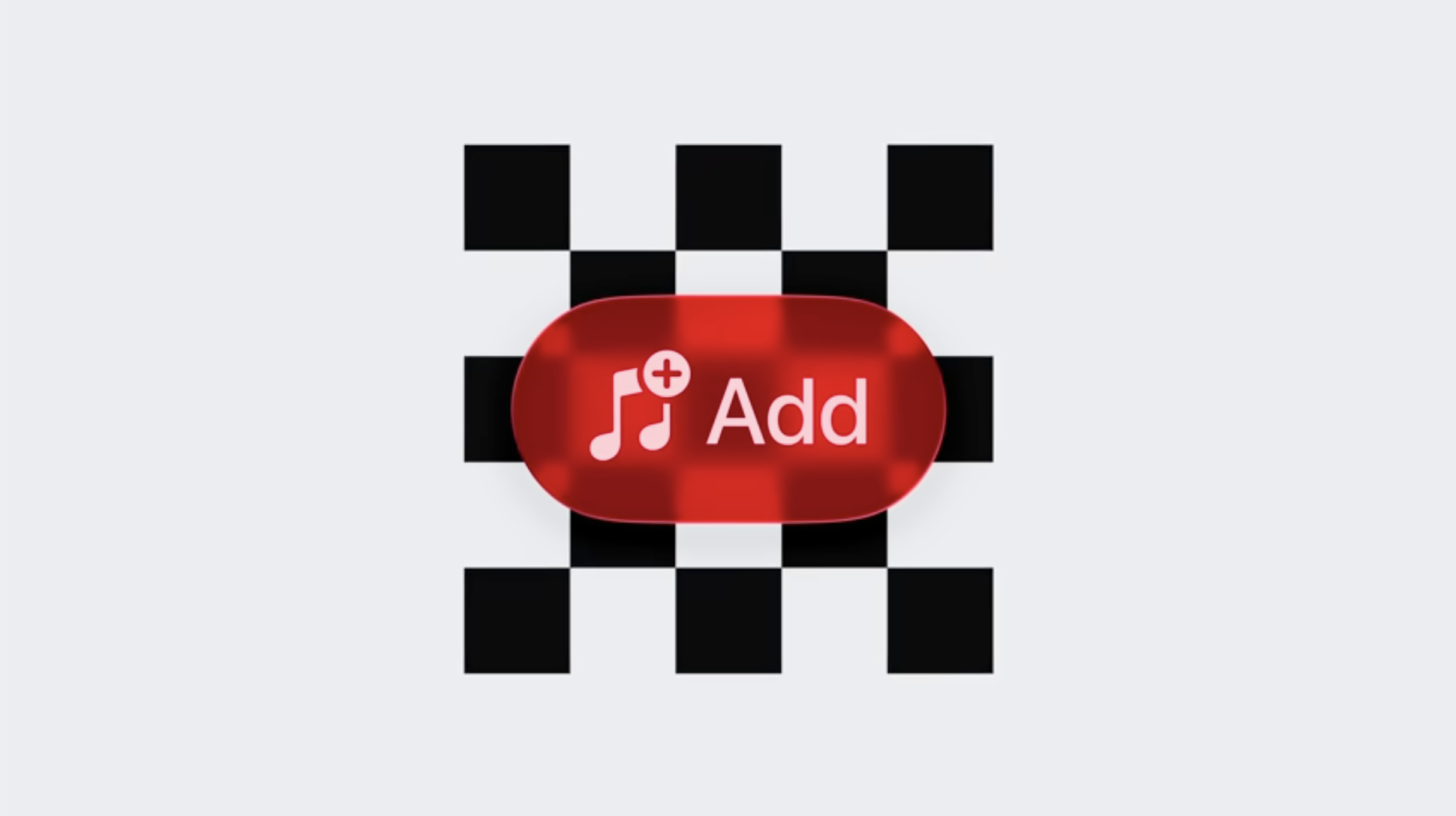
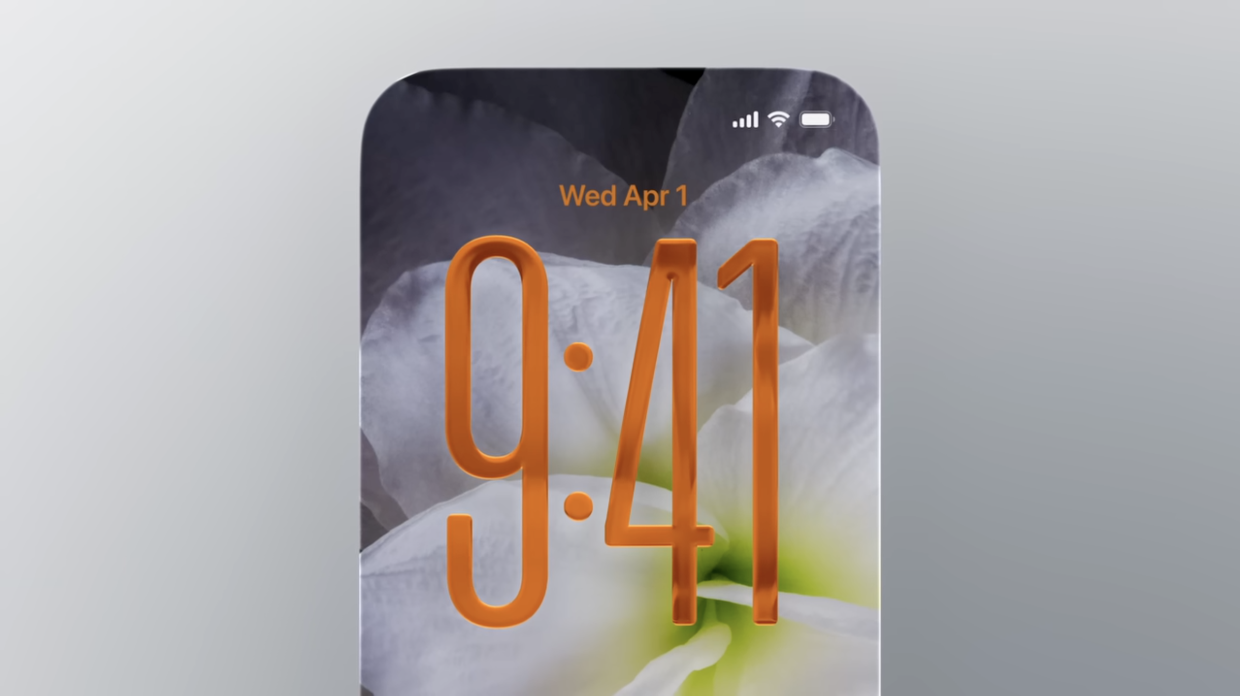
When you layer the translucent effect with a color, you still get a glassy look but the text and iconography atop them are more legible. I recently switched to using an orange liquid glass tint on my lock screen and home screen. It looks particularly great when paired with the wallpaper I am rocking which features an orange flower. But the best part is that everything is even more defined. They also bring further personality to the system. While I think everything looks cooler in liquid glass than it did before, I think that some elements are going to need to evolve from being stark clear bubbles. Take a tab bar for example. Right now a selected tab has a similarly clear background, but I think it should have a colorful one. When that tab background bubbles up for you to drag it you should feel like you’re moving a gummy candy across the screen rather than a water droplet. It would make it clearer what tab was active and the text wouldn’t be occluded when content scrolled behind it. You can see this in menus that could have different colored selectors for items, toolbars like Safari’s compact view could get blue buttons flanking the URL bar, or even imagine pink buttons in Apple News to further define the icons in each corner.
Ultimately, I think developers will embrace tinted liquid glass to bring more of their own branding to their apps. It’s sort of essential in a world where much of the standard user interface elements look very similar. Because of this, I imagine that we’ll start to see Apple embrace it more as they settle in over the next couple of years. Like how iOS 7’s design eventually gave way to thicker fonts, dark mode, bolder icons, among other changes, I can see iOS 26’s design eventually becoming more colorful. The company has already played with varying opaqueness throughout the beta cycle. They seem to have largely settled on something similar to what they originally showed. I think that means the next experiment will have to be color. Of course I could be wildly off base, but I think that’s the direction they’ll be pushed towards and I actually think it will work out quite well.